Why Obank
'An open and collaborative banking service channel'
Obank brand has been created with the aim of the open connection between customers and business partners.
The letter "O" in the Obank is the core of our brand, and its soft curves mean the bank is open and easily accessible to anyone.
Everyone can remember and say the combination of easy and simple words of "O" and "bank". Like "Oh!" the exclamation of nice surprise,
we hope the private and business customers of Obank can have amazing banking experiences through our services.
The letter "O" also means Obank strives to provide banking services that best suits the needs of our customers by integrating B2B2C services in a circle. With its leading financial solutions, Obank leads the way to the era of new banks.
Partnership that empowers
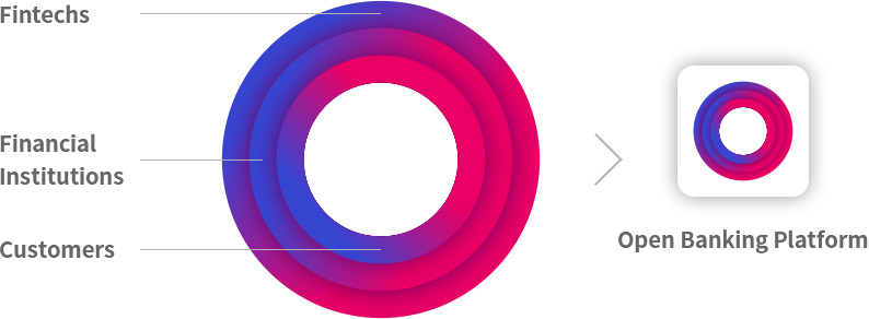
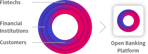
Our avatar represents our brand in its simplest form.
Our launcher icon is a perfect embodiment of our avatar. Each of the three rings in the launcher icon implies fintechs, financial institutions, and customers respectively.
Together, they capture the power of connectivity.
It connotes open bank platform business and “expansion of possibility”, the very core value of Obank.
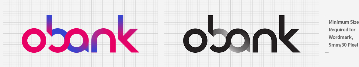
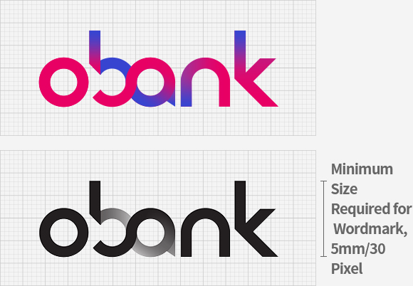
Wordmark
The interlocking band within the wordmark encapsulates the sprit of breaking the status quo and seeing new possibilities through new collaboration of banking services.
It employs the use of our primary colors, a vibrant blend of blue to magenta as our full gradient spectrum.
The notion of seamless integration and energy are expressed through the use of gradients in our logo, another strong characteristic of our Obank identity. Gradient bands capture the vibrancy of a truly digital brand.
The visual integrity of our logo must be observed at all times. Alteration of our logo in any form is not permitted.
Hangul Logo
Our Korean name in Hangul can be placed alongside our logo, in special scenarios where it is required to have our logo and Korean name appear together. The distance indicated allows the flexibility of our logo and Korean name.


horizontal Placement


Vertical Placement